Click to see a larger picture
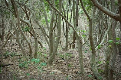
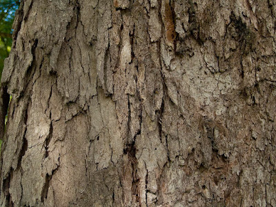
That's when I decided to have a play with one of the texture images I have taken. I selected a shot of the bark of a gnarled and woody Eucalypt that is growing my my own backyard. The vertical patterning would suit the upright nature of my trees, I felt. 
I have not used textures to any extent so this was an experiment to see what would happen.
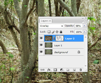
The texture was pasted over the worked picture of the trees and I scrolled through the various blending modes to see what blend worked the best. Up and down through the different blends I went two or three times and the one that suited this picture the best was Overlay. At full strength it was rather too heavy so I reduced the opacity a bit.
 Then I felt that the tree trunks were lost in all the pattern and what would they look like if I revealed them a bit more? I applied a mask and used a soft brush at 70% to paint over the major trunks and branches.
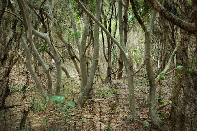
Liking this effect I did no more! It is a temptation to keep on doing more and more to a picture! So the layers were flattened and this is the end result.

Click to see a larger picture
Now this image has loads of mood! Much better than the original shot!
AJ
No comments:
Post a Comment